

Brochure Layout
Course: Publication Layout and Design
Program: InDesign
Individual
Objective:
Create a tri fold brochure for Merrill Lynch.
Use all the text given to by my instructor. However, only the text given to me by my instructor was to be used.
Use any of the pictures given to me by my instructor that I feel would further the design.
Produce logo on the front and back of the tri fold as well as one on the inside.
Summary:
I used all of the text that was given to me. Only the pictures that would further the visual design were used.
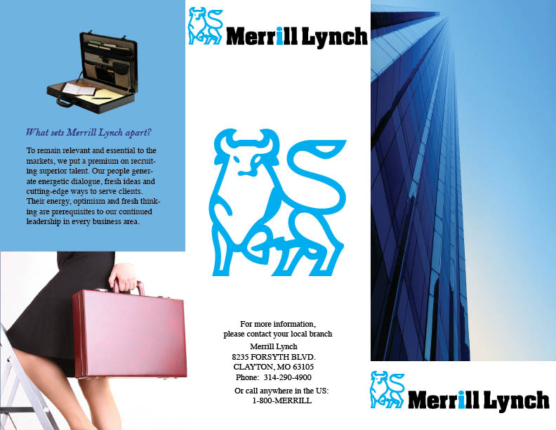
The blue that was used in the design complimented the blue that was on the cover page of the tri fold well.
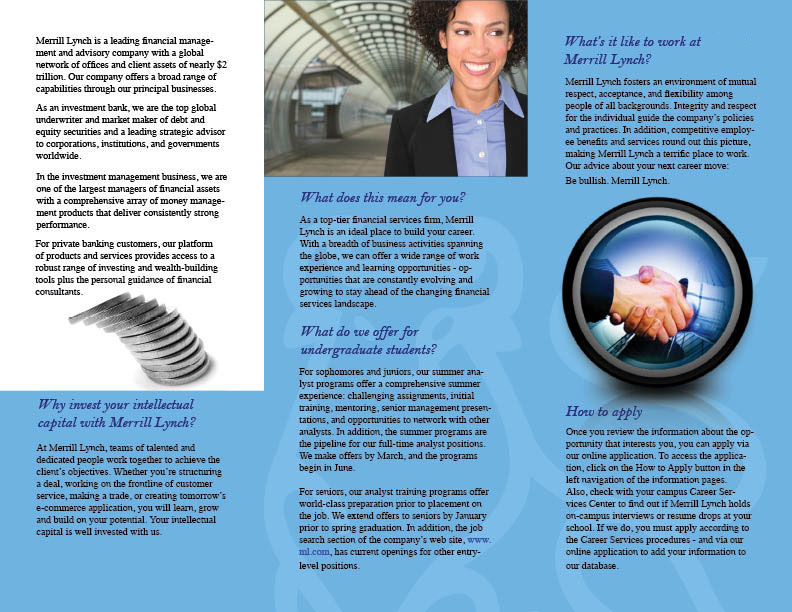
Since this was a brochure for positions at Merrill Lynch, I colored the “i” in Merrill Lynch blue to separate it. The meaning behind this is that there is an “i” in Merrill Lynch and that “i” could be you.
I enhanced the Merrill Lynch bull and used it as a faint background on the inside of the brochure. This covered the emblem that had to be inside the brochure and also gave it a nice design for the text to sit on.